While digital experiences have adapted to different devices and screen sizes, corporate logos have remained fixed. Is it time for our logos to follow suit?
Your firm’s logo is the single most recognizable, or iconic, part of your brand. It typically appears everywhere. Your building, your environment, your website, your business cards, your apparel, your vehicles, your coffee cups, your pens, your phone, your watch and the list goes on and on and on. If you look at the range of the implementation items above, you’ll see that they vary greatly in size. Yet historically, we have just always tried to force fit a single logo onto this wide variety of items because our logo is seen as a sacred idol that cannot be manipulated. Unfortunately, the result can sometimes look just like that — forced. Is this the best way to handle your brand mark? Maybe it’s time for us to adapt to a changing landscape. Or maybe, it’s time for our logos to adapt.
THE SAME OLD IDENTITY CHECKLIST
Typically when we enter a branding relationship, there is an expectation that you’ll get a checklist of iterations for your awesome new logo. Those are typically tied to usage. Like full color, spot color, black and white, single color, embroidery, etc. Y’know, the typical usage types. Sometimes, there may even be a primary and a secondary version of your logo that gets the same treatment. This is usually the difference between a horizontal and vertical layout for your mark (sometimes referred to as horizontal and vertical lock-ups). We then wrap some rules around what we can and cannot do with the logo and send it out into the hands of designers and marketers and hope for the best. But the idea that we should somehow limit ourselves to this checklist in terms of logo execution, is a very traditional way of thinking. Maybe even, antiquated?
There has always been a belief that you should treat your brand identity like some sacred cow that should never be changed, altered or modified in any way (check out any brand guidelines document!). Never ever!! The inference being that any change would somehow reduce the impact or the equity you’ve built into your logo and in some part, your brand as a whole. And that line of thinking certainly isn’t something that should be disregarded, but could it be just an old way to think about your identity? I mean, times change. People change. Behaviors change. Mediums change. Everything changes. So should our thinking.
WEBSITES LEAD THE CHARGE OF CHANGE
We need look no further as to why our thinking on logos needs to change than the simple website. As we began viewing websites on a variety of devices and screen sizes, websites and web experiences were forced to change and adapt. No one wanted to build a website for desktop, another website for tablets, even another website for phones and now watches. It was too much hassle, too much trouble and too much to maintain. The result was the responsive website. Simply put, a website that scales to the size of the screen it is being viewed on without having to build those separate experiences for each size. It does the work for you in the background without having to worry how someone is viewing your website. (I know I’m glossing over a lot there, but you get the idea). And recently, the idea has emerged that your logo can and should follow suit. Enter responsive logos.


THE RESPONSIVE LOGO EXPERIMENT
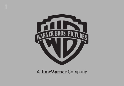
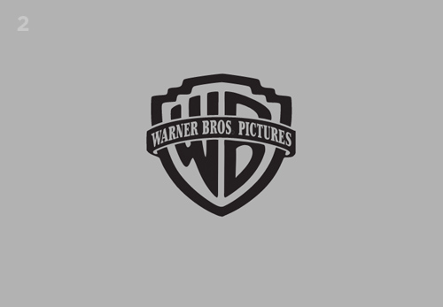
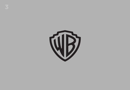
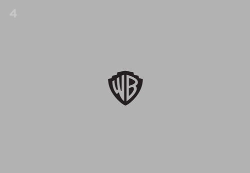
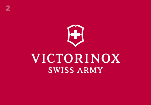
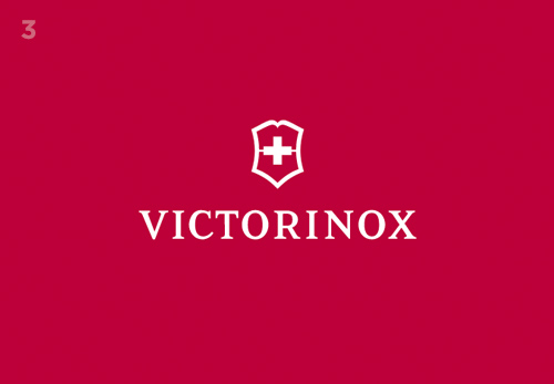
I came across a website by designer Joe Harrison that explores the idea of creating multiple usage case logos for your brand (be sure to grab the right side of your browser window and shrink the window size by dragging it to the left!). It showcases logos that scale from big to medium to small and even to tiny. On one hand I found it fascinating and innovative, but on the other I thought, “Well duh, yeah, of course this is what we should be doing. Why haven’t we?” While it seems progressive and forward thinking, it also feels very logical and simple. As designers, we can be asked to apply logo/branding across any multitude of objects, mediums, resolutions and formats that can range in size from the side of a building to a ball point pen and everywhere in between. And does a single logo really apply in all those situations? Probably not. Or purely in terms of digital screens, you can view things on a 27” 5K iMac down to a 340×272 pixel Apple Watch and also everywhere in between. So shouldn’t your logo be able to adjust and scale to all those sizes? Of course it should. It makes complete and total sense to do so. So why fight it? And why hasn’t this line of thinking been adopted en mass?
HOW A RESPONSIVE LOGO ADAPTS
When I look through the examples in Joe Harrison’s exercise, you can see the thinking that went into it. You can see that he wanted to maintain the clarity, the memorability, the readability, the recognizability and the emotional impact your logo presents in its primary/full size form and just find ways to scale it down and simplify it while maintaining all these key aspects. I think that’s why the thought process is so successful. Nothing seems arbitrary. It all looks purposeful. The recipe is actually pretty simple if you think about it. As the logo shrinks in size, you remove the things that are smallest, least consequential and could become hard to read/decipher at smaller scales/resolutions. Sometimes this means removing bits of fine detail or smaller text or maybe enhancers to the logo mark. But as long as you maintain the overall “feeling” of the primary mark, it can be successful.
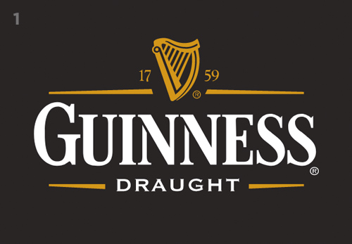
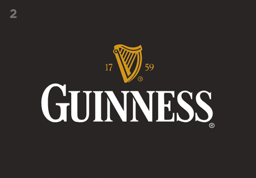
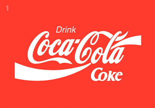
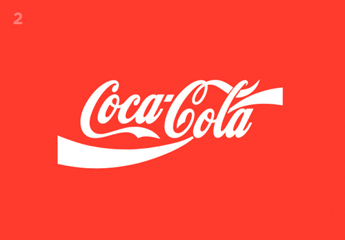
The Guinness logo is a good example, though I realize they have rebranded since this was done. The full mark consists of these basic parts: harp, year, name, descriptor and decorative line-work. The first step down removes the descriptor and line-work. The next step down removes the year. The last step removes the name and all we are left with is harp in the fourth and final step. This is the basic pattern and I think that’s why I find the matter-of-fact of it all to seem so expected. Like a song, there is a rhythm to process and it makes sense.
CAN THIS WORK FOR EVERYONE?
The reality is that it’s that last step in the 4-step scaling that can make or break the entire process. If we look at the Guinness example again, we are left with the harp at the end. And because the harp is synonymous with the Guinness brand and has been used since 1862, it’s a no-brainer to make the connection back to Guinness even if you never saw the previous 3 iterations or the brand name. And that’s the catch. If you were only presented with the last step, can you connect it back to the master brand? If the answer is no, then that iteration could be deemed a failure in execution. I would say all of the exercises presented by Joe Harrison have varying degrees of success at this step. I’m still not completely sold on Coca-Cola because it feels foreign to see “Coke” written in the “Coca-Cola” style, as opposed to the “Diet Coke” style or even “New Coke.” But that’s my age showing (or maybe I’m being a little too nit-picky).
I will say that all of these examples are successful in the smallest size simply because they have the benefit of being from a long-standing brand that’s been around for ages and has probably touched everyone in some way or another. The overall familiarity with the brand is key to making a concept like this work. That’s not say a less familiar brand couldn’t or shouldn’t try something like this, because I think they should. But familiarity helps propel it forward into a success. The other side of the coin is that taking a bold step with your brand like this and having people interact with it in this way CREATES familiarity. I mean you can’t build that connection overnight. So, while it may seem like a brave decision at first, over time it will become just another brand touchpoint.
IT’S TIME TO ADJUST TO THE CHANGING LANDSCAPE
The need to adapt to a changing landscape isn’t restricted to a certain percentage of brands, it’s for everyone. After studying this, I’ve been thinking back to the many branding projects I’ve worked on in my career and I wonder what it would be like to go through an exercise like this with those logos. It could be a fun thing to do. I know it’s something I definitely want to explore with our clients moving forward.
