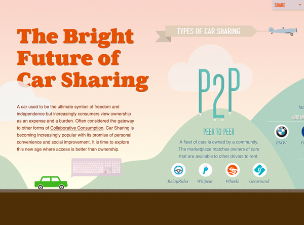
Interactive content creates a fun, informative and immersive experience for thought leadership consumers, all while boosting user engagement. Learn what it takes to make a compelling interactive landing page and get a taste for one of the rising stars that brings the art and science of marketing together.
When I think about “interactive motion” on a webpage, I always think back to a small part in a random old 90’s commercial from IBM. Two people are talking about building their website and one of them is focusing on the visuals and the other on how they want the website to function. The visual person says something along the lines of “We can have a spinning logo. Or flaming logo. That’s cool.” The other speaks about having global customer access to a product on a website that coordinates billing, vendors, etc. In simple terms, the commercial is about not putting form over function. Meaning building your website is not about the fun and cool things you COULD do, but the technical things your site SHOULD do for a better customer/user experience. And I suppose that still holds true in some way, but people no longer want to sit on the sidelines and just observe content just because it’s what you want them to see. That’s no longer a “good customer experience.” No, they want to interact with it. Engage with it. They want to become part of the narrative or find a way to shape the story. They want to feel like a character in a movie. And that’s where interactive content comes in.
Immerse Yourself
Now we use the term “interactive” content, but I am not sure “interactive” is the best descriptor. Because what users crave isn’t just an interactive (click, click, scroll) experience, but an immersive experience. They want to touch it. Watch it. Hear it. An experience that visually brings them in a bit deeper, a little closer and allows them to watch a story unfold. No longer stuck in their desk chair and being spoon fed page after page. Maybe the content is something that may or may not provide them with a very user-specific answer or something that feels complete and custom to them and them alone. Or maybe it’s just something that takes their answers and shapes their journey. Those types of immersive experiences can come in many forms, but here are few of the more common types: quizzes, tools, polls, contests, games, surveys, calculators, sliders and interactive landing pages. Now for the most part, these are pretty self explanatory and I would venture to guess we’ve all experienced at least some, if not all, of these. I know I’ve found myself sucked into a quiz about my favorite TV show or a survey about my favorite heavy metal album cover. But what’s left at the end of that list can be a little vague: Interactive Landing Pages. And that’s really what I want to talk about. Content that begins to take life as you scroll down a page. So instead of scroll, read, scroll, stop. It’s more about building a story as you work your way through a web experience.
Truthfully, it’s really difficult to verbally visualize the type of interactive experience I am talking about when it is something you need to experience. So go take a look at this example below and come back. Please?

Example:
AirBnB Berlin – Economic Impact
Phew! I was worried for a moment. Thanks for coming back! I think it will be a bit easier now to talk about what an interactive landing page is. Now, I love everything about this Airbnb experience. From the small bite-sized chunks of information, isolated and informative data points, subtle animations, user-activated content “extensions” and the fact that you not only move down, but also in to the experience. It’s actually quite stunning. Even though I probably won’t be going to Berlin any time soon, I found myself actively clicking around hoping to uncover something I missed. Truth be told, the only thing I thought it was missing was the way it ended. I felt like it didn’t quite stick the landing. But that’s okay. This was built purely as a brand learning experience. An experience that means to slowly build a story, give the participant the ability to learn more about multiple things and help grow the brand. And I think it was extremely successful in that. I also think it represents just about everything a great interactive experience should and shouldn’t be.

Example:
Every Last Drop
All the Best Parts
But that kind of specific experience might not be right for you. So what do you need to build effective interactive content? Try incorporating some, if not all, of these ideas.
Tell a focused story
Storytelling matters. I feel like I read that somewhere. But it’s true. Especially when it comes to an interactive landing page. It’s the foundation to building an experience that takes people by the hand and directs them down the path you want them to go. A focused story or “reason” for this page to exist is imperative. And that reason can’t be a “marketing reason,” either. If a user is going to spend the time going along with you on this journey, it needs to be a journey of discovery, not “buy my stuff!” It should be equal parts educational and entertaining. And it should be delivered in small, snack-sized nuggets of information laid out like bread crumbs leading to the life-sized gingerbread house in the forest. The user needs to feel like it’s all leading somewhere. Each small step leading to a larger leap ending with a big jump at the end. Start small and expand your story as you build.
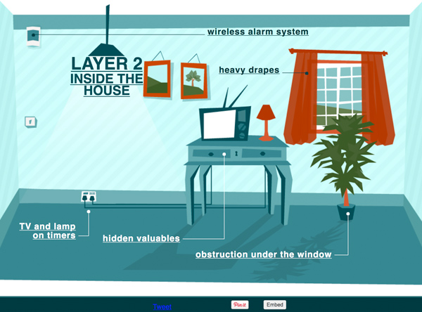
Example:
SimpliSafe – Layered Defense
Tiny Interactions
And speaking of small, be sure to put in a few rest stops along the way. Some place for the user to stop and catch their breath. An area to “click around.” An example being an interactive chart or map or graphic that allows the user to learn more on their own terms. Meaning you want the visitor to feel like they are shaping the story as well, so give them places to find something relevant only to them. Where they have their say to uncover and discover what they want, not what you want to tell them. It doesn’t have to be anything overly complex, but those tiny interactions go a long way and help to craft that larger experience at its core.
Choose Your own Adventure
Now if you really want to pull a user into the driver’s seat, try approaching some aspects of the page, like a choose your own adventure novel. So when a visitor reaches a certain point in the story, you give the user a choice on which direction to choose next. It’s almost like putting a few forks in the road, if you don’t mind me overusing the “journey” metaphor. By giving them additional directional paths to choose and continue their journey, you can engage a user with more custom content. These self-navigated paths really pull the user deeper into the storytelling process and makes them feel like you’ve built this content just for them. Like the color blue? Click here. How about orange? Click over here. But it’s not a tiny interaction like above. It can be a full on detour. A new branch to the interaction that ultimately still gets them to the same result. Sure it is technically a pre-planned path, but to the user it’s an adventure of their choosing.
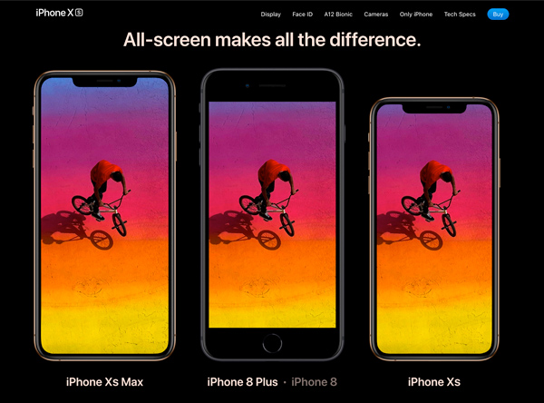
Example:
Apple iPhone XS
Make an under-statement
The easiest thing to notice is just how much interactive motion there is on most of these pages. I mean, how can you miss it? The animation is pretty much the basis of what makes these pages interactive in the first place. The true difference maker though, is really how understated the animation is. A simple fade up here. A quick enlargement there. A scroll activated movement over here. The key is being selective about what does and what does not animate. Small, isolated movement grabs the user’s attention and gives them a reason for their eye to move from one place to another. It keeps them entertained, while adding to that sense of discovery I spoke towards by giving them an anticipatory feeling of “what’s gonna happen next?” That intrigue is key to keeping eyes glued to your page. On the other side of the telescope, having everything move is the same as having nothing move. Too much motion makes users blind to the motion altogether and causes them to lose focus, or worse, could give them a feeling of sea-sickness. Bleach! And who wants that? Keeping your animated effects simple makes them more effective. By being understated, you make more of a statement.
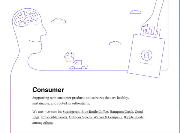
Example:
the Collaborative Fund
Sights and sounds
This part is tricky and may not be for everyone, but adding video or sound elements to your interactions also helps the experiences become more immersive. Now of course we all know that auto-play videos or music options without a mute function are big no-nos, but adding small sensory things like sounds and video enhance the overall experience. Much like your animation choice, the key is to be selective. The last thing you want is your content to sound like a one-man band. A cacophony of noise is nobody’s idea of a pleasant experience. Video on the other hand is a bit easier. You could have a short looping video in the background of a section or an easy YouTube embed for a more detailed section of the story. But the trick is to hold back when you want to add more. For something really compelling, take a look at the example below for a pretty unique way to add a video-like interaction.

Example:
Tillamook Cheese Sauce Starters
Stick the landing
You don’t want this journey to all be for naught, do you? No, of course not. You want users who took the time to reach the end to know that it was all worth it. This could/should have felt like a personal experience for them, so be sure to find a way for it to feel that way until the very end. It’s a pretty simple idea. Set an expectation at the start and deliver on that expectation at the end. No one likes to be mislead. So whether it’s an action to buy a product or a sign-up for downloadable content or even just a link to learn more about something similar, it doesn’t matter. Just be sure you end with a roar, not a whimper.
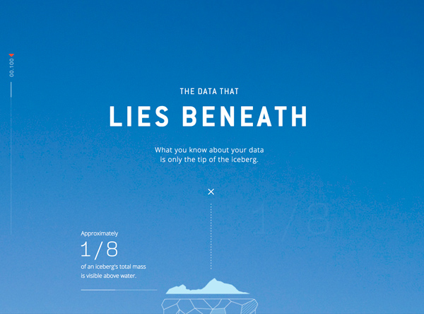
Example:
The Data that Lies Underneath
Engagement Party
Engagement. It’s what marketers crave. Just ask Captain Jean-Luc Picard and his smooth English accent. But purely by it’s nature, it should come as no surprise that one of the biggest benefits of an interactive landing page is increased customer engagement. By definition, engagement is just the simple act of “user action” or “interaction.” So by default, any piece of interactive content increases engagement because you have to “engage” with it for it to become “interactive.” Referring back to some of the examples above, the page needs you to interact with it to reach it’s full effectiveness. You need to take action and scroll. Then scroll fast. Then click on expansion buttons. Then watch the story unfold. Then hover over a section to learn more. You have to physically do something to reach its full impact. You are not just passively engaging with the page by reading, scrolling, reading some more. No, you are “actively” engaging with the content. And active engagement leads to increased brand awareness, brand trust, and of course, conversions. Active engagement allows you to build deeper relationships with readers and customers alike. It helps you connect with them over time and keep them fans of yours. And once you’ve done that, the odds of them filling out a form or handing over some information about themselves is much greater and can lead to an increased conversion rate.
The writing is on the wall
There is an increasing sense that the days of your standard, static written content are numbered. Not “the sky is falling” or “the end is nigh” kind of feeling, but there is an inkling that the times they are a changin’. With the popularity of video, podcasts and now interactive landing pages on the rise and users’ attention spans on the decline, it’s impossible not to feel this way at least a little. The habits in which people interact with content is changing. And as marketers, we need to adapt or risk being left behind. But it’s also a pretty exciting time if you believe in the marriage of Art and Science in marketing like we do. Interactive content like this brings the two together with a base in storytelling and moving visuals, combined with increased engagement and conversions. But on a much simpler level, it’s just cool and fun for the reader to immerse themselves in content of this nature. And who doesn’t like a bit of fun every now and then?

